about
Blockspot is a social app, in the making, meant to help users figure out which place they should go next based on popularity and/or places their friends are.
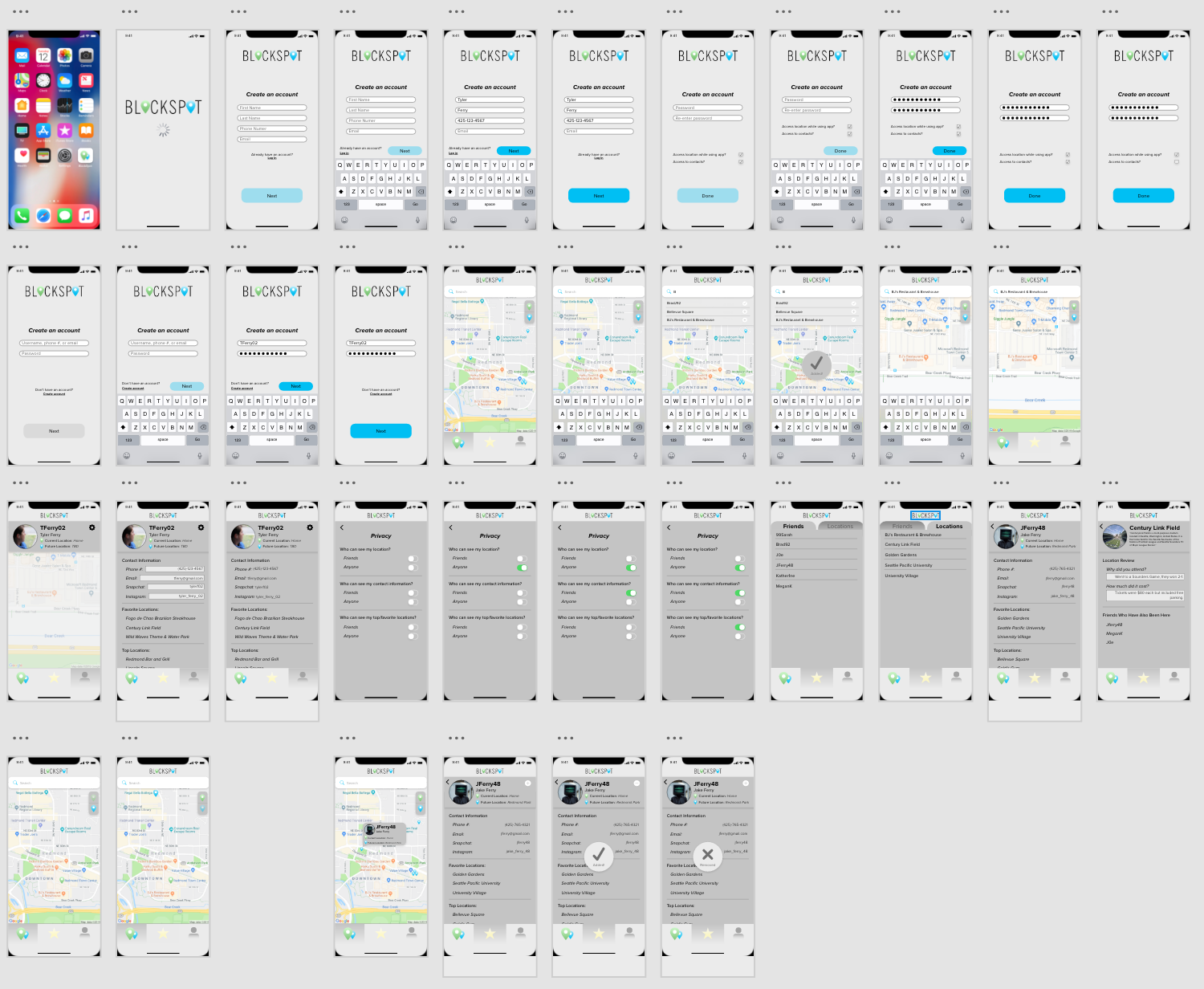
My goal was to produce branding, a wireframe, and a mock up prototype of the app. I used Photoshop to design the logo and app icon. I then narrowed down the fonts and color scheme that would be used throughout the app. I had a general overview wireframe from my stakeholder but reproduced a longer step-by-step wireframe on paper. Once completed I mocked up the prototype of the app in Adobe XD.
role
UX/UI Designer
when
Summer 2019
tools used
Photoshop, Illustrator, & Adobe XD


the concept/idea
They brought me the idea that they wanted to make an app called Blockspot that could help you know where to go based on popularity, when they were going to be busy, and who you know was going to be there.
I was told to form a brand based off the name of the app, the content of the app, and the two colors they wanted included (blue and green). Then I was given a general overview wireframe and told to make a prototype in Adobe XD.

the process
I first started drawing a bunch of logo designs on a whiteboard messing around with shapes and layouts but making sure it stayed simple. I made a blank Photoshop document and mocked up those logos. I also mocked up some app icons that would go with the logos. I then generated a few color schemes too. I also chose a few secondary fonts that could be used throughout the app.
Once I put all these in a document I sent them to be reviewed to make sure I was going in the right direction. They liked the colors I used in the logo examples and then they picked a font, logo, and app icon.
With this direction, I finalized the logo and app icon then started redrawing their wireframe but more in depth and then worked on the Adobe XD prototype once I was done.
I checked in multiple times throughout the making of the Adobe XD prototype. I presented other ways to showcase items, change the flow of what screens connect to each other, and just make sure what I have is what they want.

the result
The end result was two logos (black/white font colors), an app icon, color scheme, decided fonts, and an Adobe XD prototype (see above to view video of Adobe XD walkthrough).
reflection
Overall this project was super fun to work on. I got to work in Adobe XD for the first time and enjoyed how easy it was to make a prototype that clearly showcased the application. I also enjoyed how much creative freedom I had compared to what I thought I would have for this project.