about
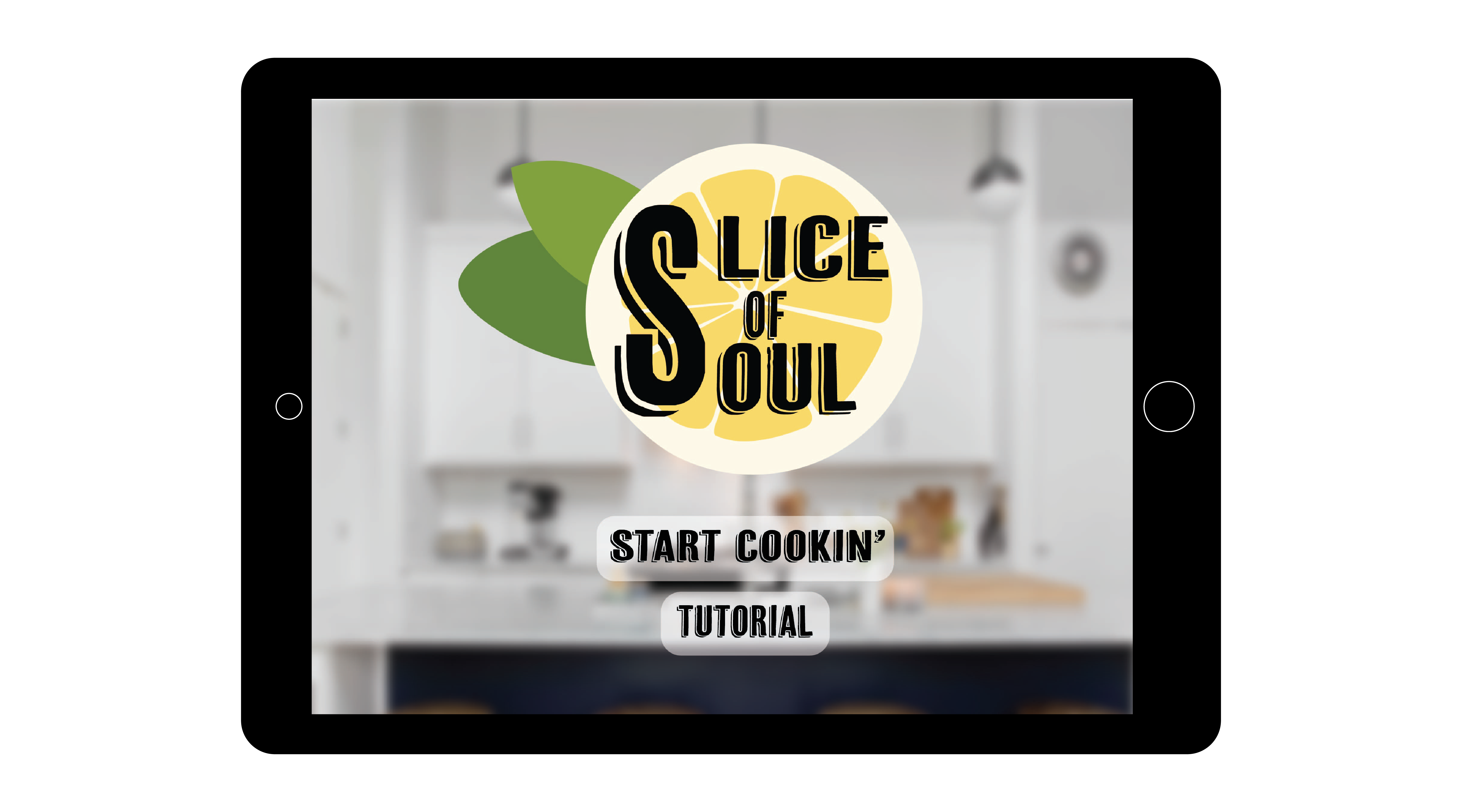
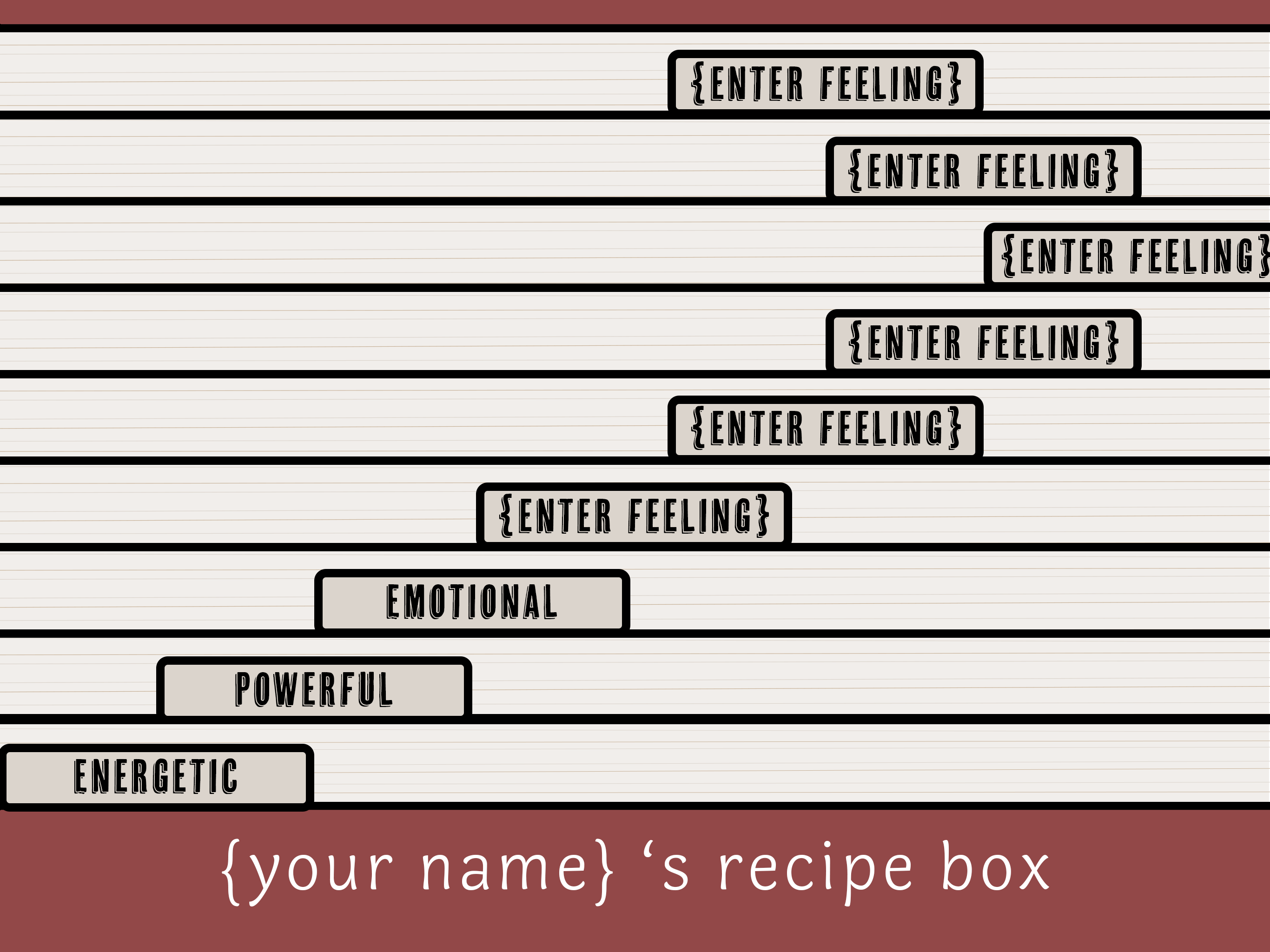
Slice of Soul is an interactive storytelling AR app. The user goes through a questionnaire to figure out the type of mood or experience they'd like to have when cooking. Once the user has chosen, then our AR cooking set up appears (the first instruction along with the ingredients needed). Clips of audio will play once the user starts a new instruction. The audio is about what the recipe means to the person who originally made it. The user will not know the name of the recipe they are making until they are finished cooking. The goal of this app was to play with empathy and how different recipes might make people feel. Each person has their own recipe box that they add the recipes they've completed too. The user can then title each tab with a certain feeling and can sort each recipe they've made.
role
Co-designer
when
Winter 2019
tools used
Photoshop, xCode, 3d Scanner, iPad, Skanect, & Meshlab
the concept/idea
As a group, we wanted to tell a story through our app. With the only requirement for this project being that it has to be AR, our options were pretty much endless. What we all resinated with was creating a storytelling app through step-by-step cooking. The idea was to add curiosity to what they are making as well as allow the reader to focus more on the story.
Originally, the plan was to show the recipe name up top, the ingredients on the bottom with the AR objects in the center. After our first pitch to our class, we found that with this approach, why would a user wanna keep playing if they already know everything up front about the recipe? Why would they just wait to listen to the audio?
the process
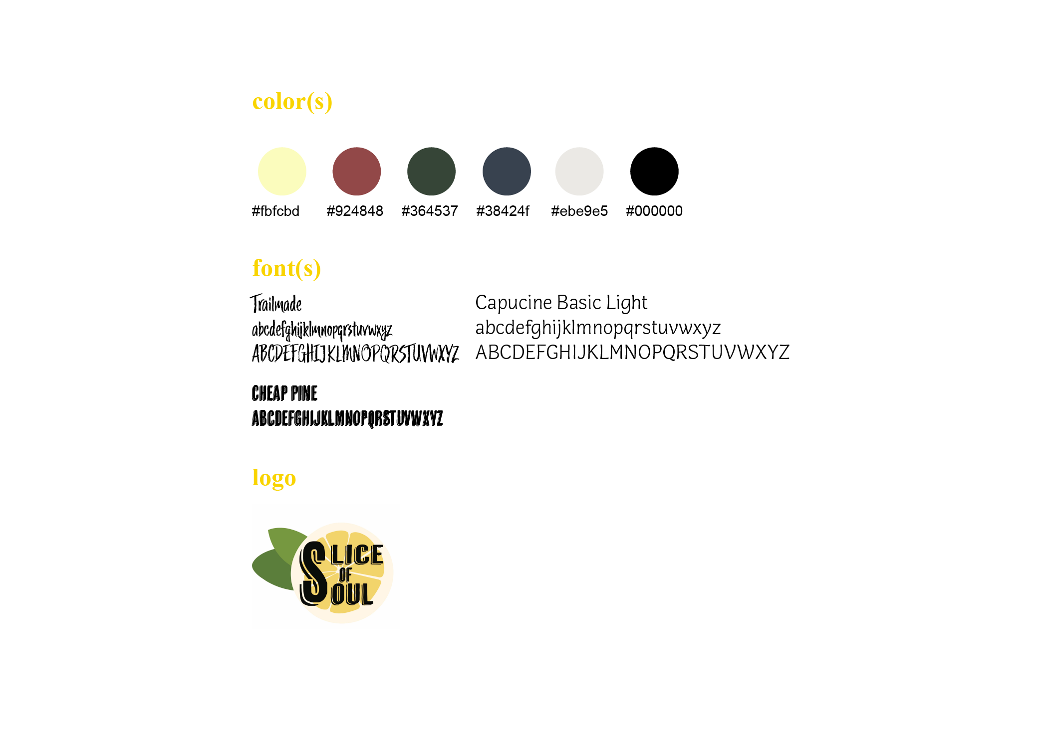
When I was choosing fonts and colors I wanted it would have an Americana kitchen type of feel to it. Adobe had a font kit that reminded me of a diner so I chose three of those fonts that best fit with the theme we where going for. Cheap pine was used for a majority of our project from our logo to buttons to instructions. Trailmade was used for our recipe cards because it looked hand written. Capucine basic was used for everything else because it felt like a great mixture of both of the texts and wasn't too overpowering.
For our color palette, I wanted to choose muted colors in order to not stand out too much but to go well with most recipes we had and help set the mood to spark empathy for the user. The main colors used where white, a tan/grey, yellow, green, red, blue, and black.
Our other designer, Abbie, and I worked together to brainstorm a logo. We knew from the start that we wanted a big S to connect the slice and soul of our app name. From there it was all about finding the right font. At first it was to curvy so, once I found the font kit shown above, we used cheap pine which was perfect for what we where going for.
We knew we wanted a recipe box that users can play with. Each user has their own recipe box where they can change the name of the box, they can sort their completed and in-progress recipes by their own feelings they felt, and in the future we would like to implement an option to share their personalized recipe boxes with others and have an option to make their own recipe. Abbie made the 3D closed and open box while I made the inside of the box. For me, it was difficult finding a font for the labels of each folder because while I wanted to use a handwritten type of font, it wasn't super clear to read.
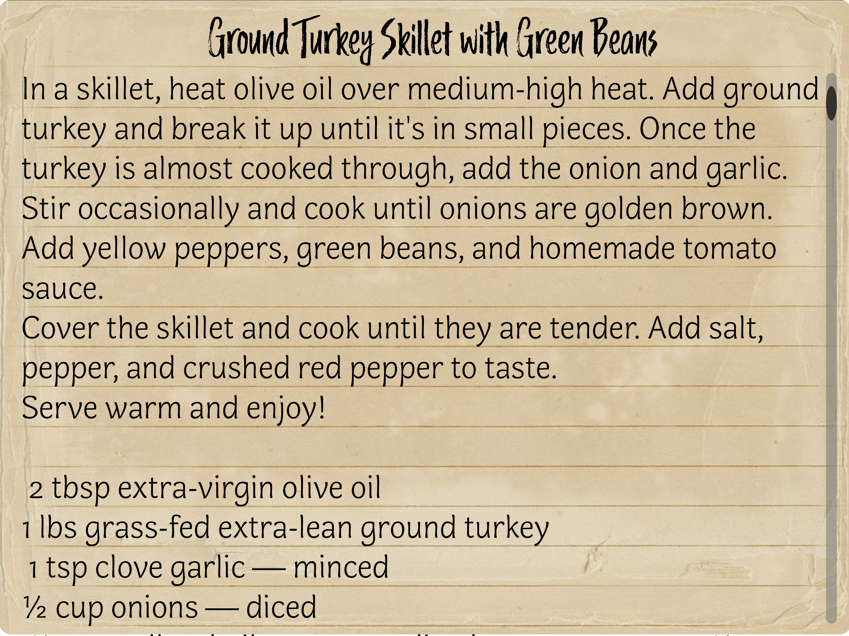
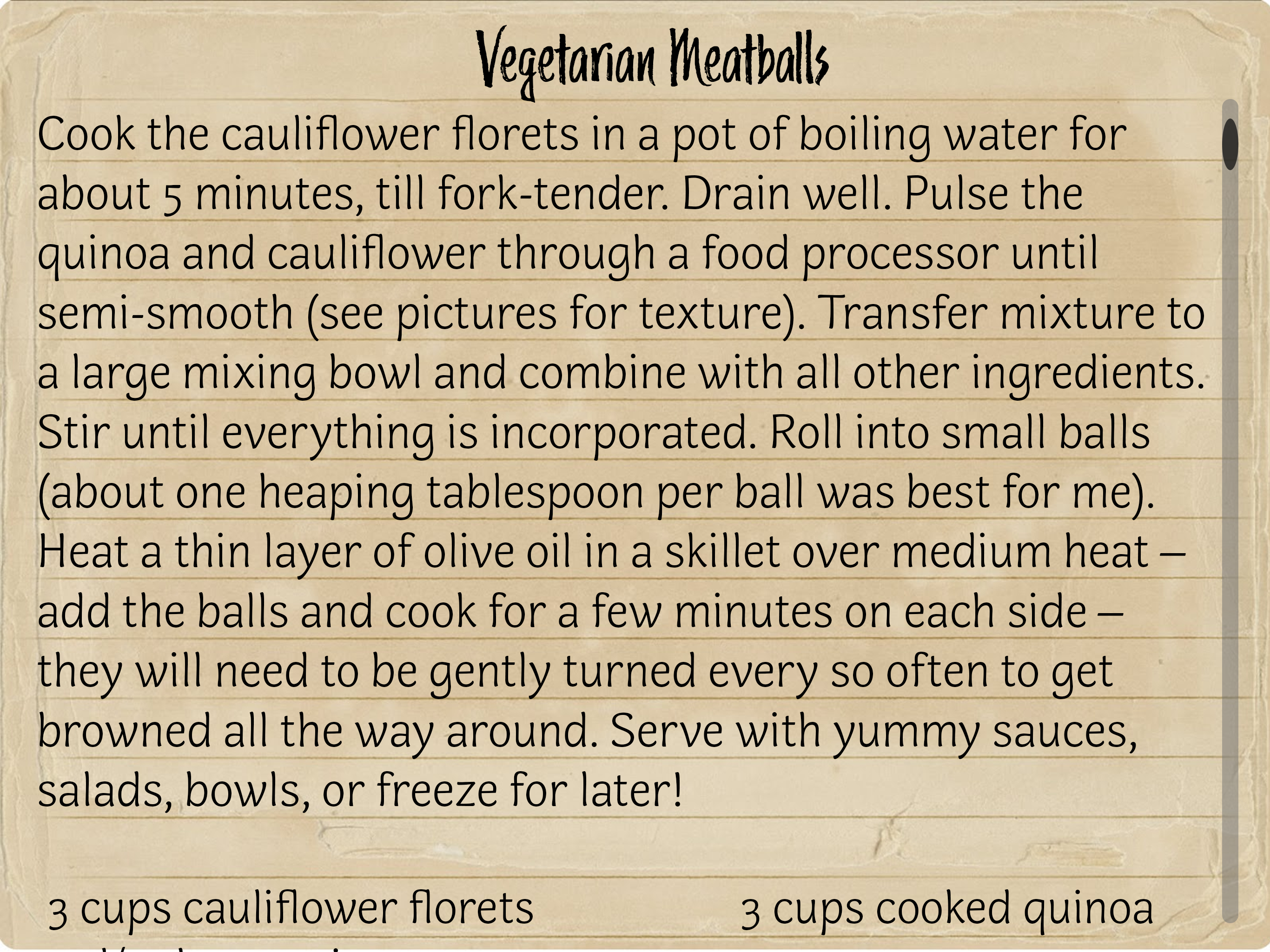
I found a worn index card online that went along with our theme. From there I designed the questionnaire page with it along with the recipe cards using the index card as the background. For the recipe card the user gets once they've completed the recipe, I have the title of the recipe on top with the instructions right below. After that is the ingredients and at the very bottom we give credit to the person who contributed their story and recipe. For the questionnaire page, I originally had opaque buttons beneath the text but that felt to distracting so after talking with my group we ended up agreeing on using coffee stains to show the button cause it went with the feeling of the index card already by looking authentic and a little used.
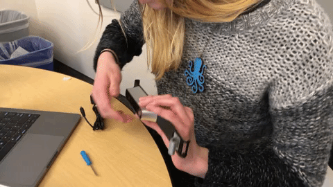
Something really cool about this project in particular was that our professor got us a 3D Scanner that connected to an iPad so we could scan in our own 3D objects that would go along with our recipes. This was a very big learning curve and took a lot of time to understand and scan in. After many takes we finally got to add in assets to for the beginning of our recipe. We also found out that I'm the perfect height to scan items.
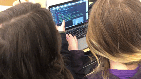
After we where done scanning, it was time to work on the code. Christa was our main developer and I would pair code with her when needed. We found it difficult to code on two separate computers and share code over GitHub so this ended up being the best option for us. I added in all the static screens before the AR screens as well.
With our new idea, the user goes through a questionnaire to get to a new AR recipe. Within the AR recipe, the other designer and I decided to move the instructions to the bottom of the screen so that when subtitles weren't on (the subtitles generate at the top of the screen), the screen wouldn't feel to top heavy and it left more room for the user to play with the ingredients. We have a home button to take the user back to their recipe box and we also have a help button to remind the user of the gesture to complete an instruction.
the result
In the end we had our own 3d objects we scanned and a fully made segment of the app (one recipe).
reflection
This project, I learned how different placement, color, and font can be when developing and designing for an AR app. I enjoyed dipping my toe into design for the first time and would love to do it more often. I also had fun exploring how to convey storytelling into an app.