about
The UWB (University of Washington Bothell) Sustainability website is an online resources for students and faculty to learn and engage more with on and off campus sustainability.
Our goal was to conduct UX/UI research on the website itself and produce two design ideas to present to our stakeholder, the Sustainability Coordinator. We ended up using Google Analytics, surveys, interviews, and website walkthroughs to help inform our design ideas.
role
Project Manager & UX/UI Researcher
when
Fall 2019
tools used
Google Analytics, Google Drive, Surveys, Interviews, Website Walkthroughs, Facebook, Photoshop, 360 Camera, & Wix


the concept/idea
My group was assigned to work on the University of Washington Bothell Sustainability Website. We worked directly with the sustainability coordinator (our stakeholder) throughout our process. We were tasked to improve the website by making it more user friendly. This would be done by performing our own user research and presenting two design solutions at the end of the quarter - one solution would be realistic while the other is more "futuristic".


the process
Throughout the process, as the project manager for this project, I generated our schedule and assigned tasks to everyone.
Our group started by splitting the research into 4 sections - Google Analytics, in-person interviews, online surveys, and website walkthroughs. We received Google Analytics for the Sustainability website with a few years of data but realized the data that was collected was so minimal and didn't give us the information we were looking for. We then moved onto forming our own interview, survey, and website walkthrough questions.
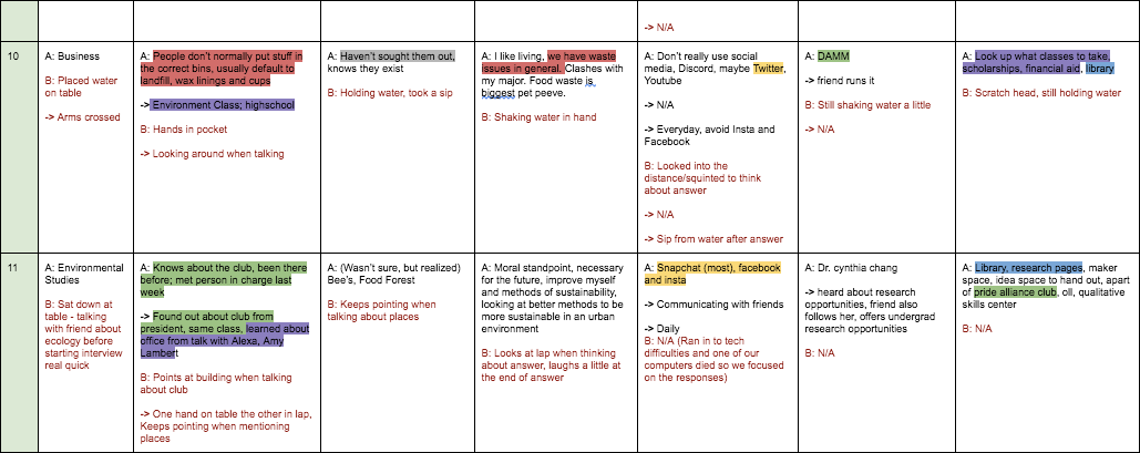
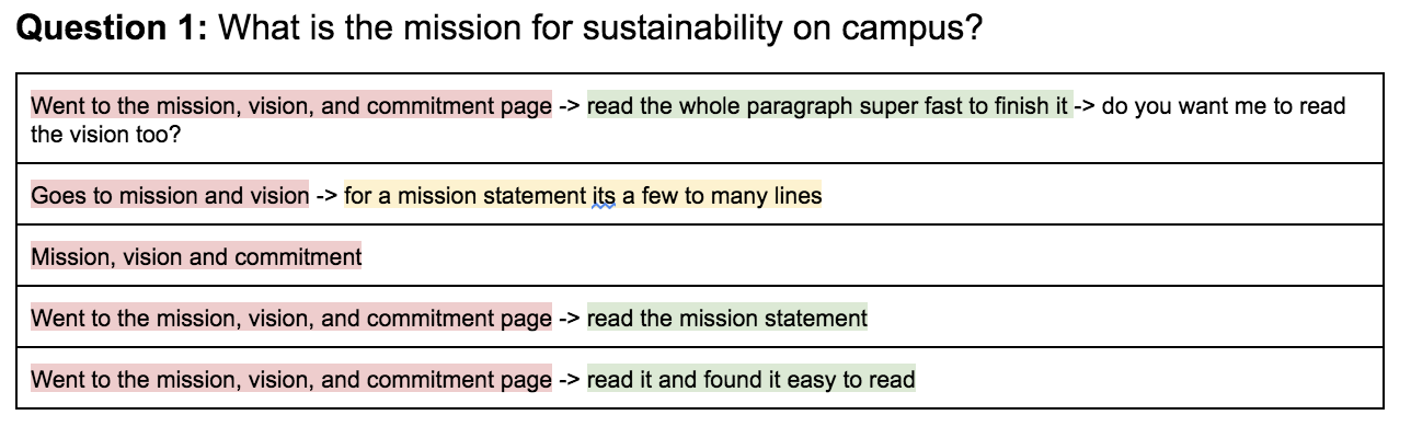
I was in charge of writing down body language for the in-person interviews. I was also in charge of conducting all the website walkthroughs. For the website walkthroughs, I had people viewing the Sustainability website in front of them and asked them specific questions they had to then find on the website. After coding the set of data I collected, it was easy to see which pages were self-descriptive and which ones weren't. From this data, I also found that a lot of the links were broken, some information on the website was out of date, and some pages seemed like they could be combined.

After coding all the data we collected from the interviews, surveys, and website walkthroughs we then moved onto generating design ideas. We spent a whole day writing on sticky notes in cycles with limited time (usually 5 minutes) then reflected on everyones ideas, clumped similar ideas, and did it all over again with new directions in mind based off seeing others ideas. We eventually agreed on three main ideas; create a doc with all the minor changes to the website (updated info, broken links, where to combine pages), stickers that promote the sustainability website (knowing that people normally put stickers on reusable water bottles which are more sustainable than plastic bottles), and lastly, adding AR imagery throughout the website to see the sustainability resources a little more up close and personal.
Once we presented our top three ideas to our stakeholder, we found that she isn't as interested in marketing the website and gaining more traffic but rather making sure the information on the website makes sense and the flow of the website is clear. This made our two final ideas stand out - creating a document with all the updated information we feel the site should make and the AR imagery.
With these two ideas in mind, we split the group up and mocked up the ideas. Two of my group mates and I worked on the website document while the other two group mates worked on taking AR images and placing them on a temporary wix website. My two group mates and I divided up the website pages and had a shared document where we added the pages and sections that had outdated information, unclear information, too long of paragraphs, broken links, places that could use more information, and pages we felt could be combined.
the result
We presented our two design solutions to our stakeholder (see the video above for the actual ppt we presented). We then created a research report outlining our design process that we then sent to our stakeholder (see link above to view report).
reflection
Overall, I enjoyed this group project a lot. I learned how to do user research for the first time and although our group was uncertain which data we needed to make this project successful, it was helpful that we tested each (interview, surveys, and walkthroughs) so now I know for the future what methods are useful for certain research. I also loved working with the Sustainability office and getting real world experience. Our group also seemed to just mesh super well, we all had similar interests and humor that it created such a fun environment to work in.